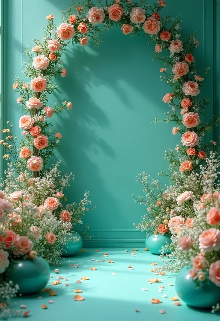
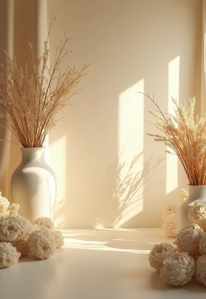
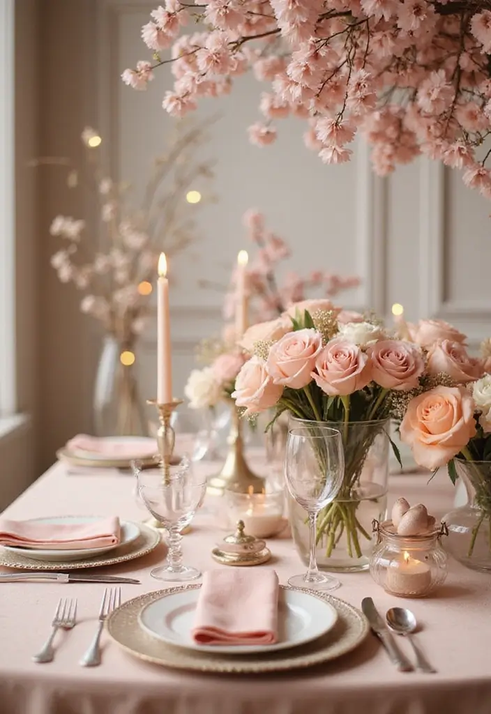
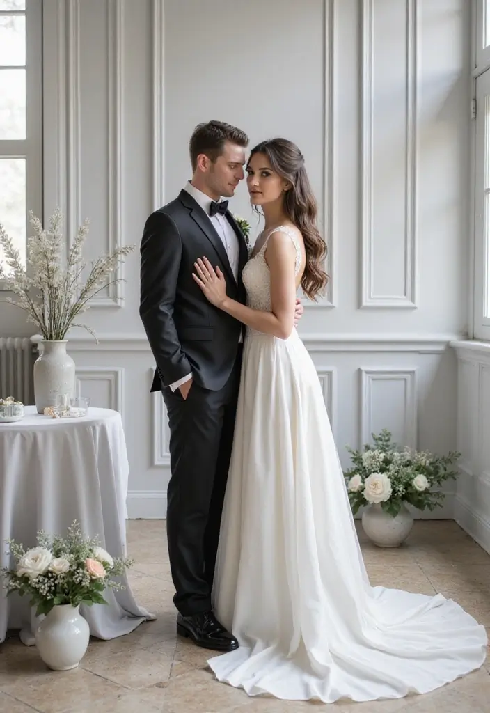
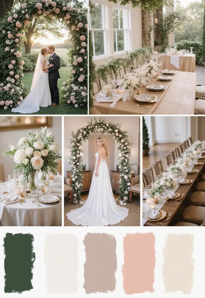
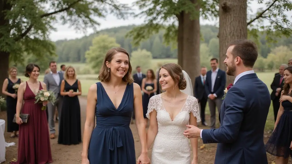
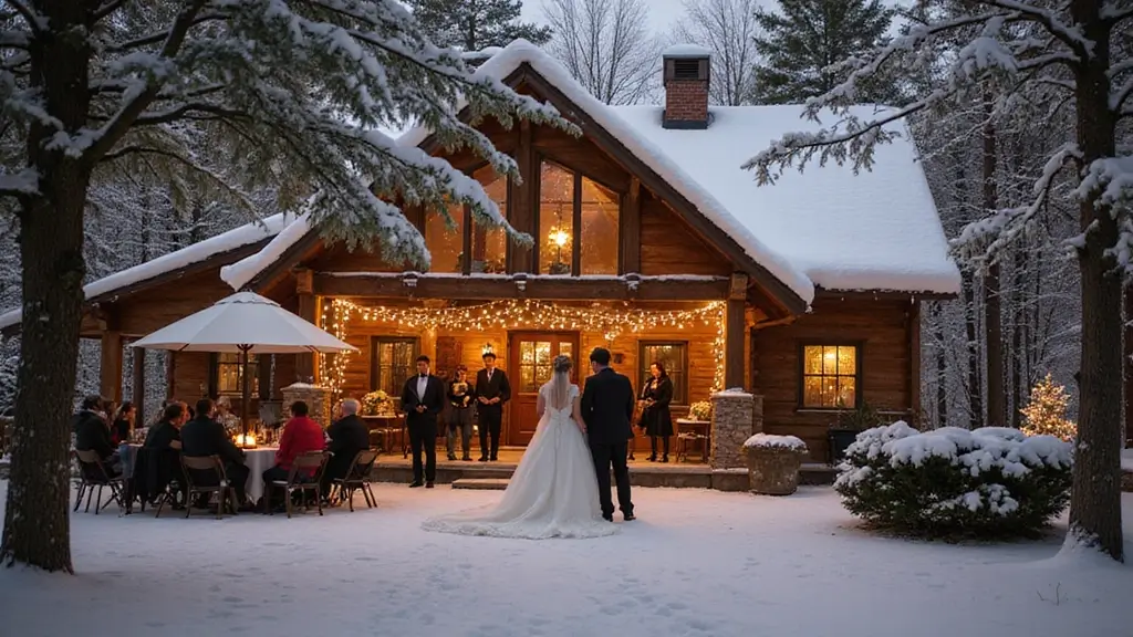
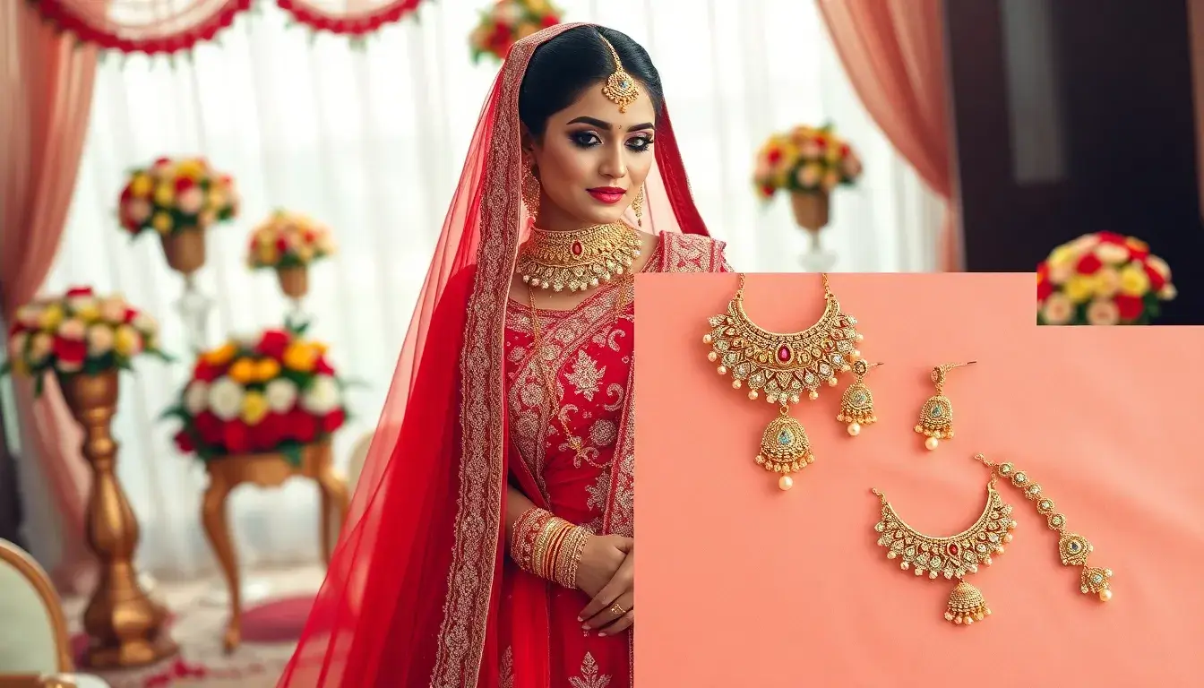
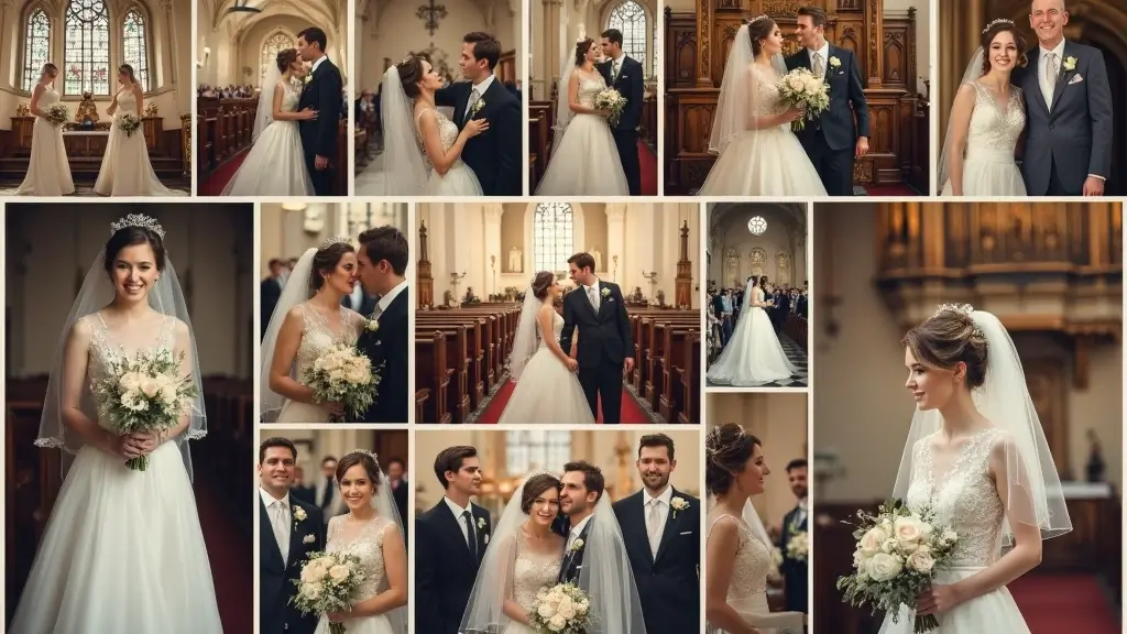
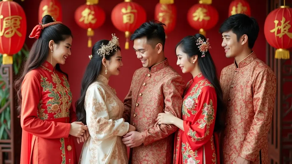
Here is why I made this post. Planning a 2025 wedding color palette can feel like a big mountain to climb. I keep seeing couples wrestle with shade after shade and still worry it won’t read right in photos or in rooms with mixed lighting. I pulled together 26 elegant options that balance warmth, depth, and shine. They are ready to inspire your celebration.
Who it’s for: If you want a stylish look that still feels true to you, this is for you. Whether you are the couple planning your day, a sister or friend helping with design, or a wedding pro seeking ideas, the palettes here speak to people who care about mood, texture, and how guests feel when they walk in.
What you’ll get: I pulled together 26 elegant color ideas for 2025 weddings and practical ways to use them. You’ll find color pairings that are easy to mix in decor, florals, table settings, invitations, and outfits. Each palette includes a quick guide on season, lighting, and photography so your moments stay true to the mood.
How to use them in real life: Picture a soft ivory dress with sage greens and champagne accents. Think velvet napkins, brass candle holders, and powdery pink blooms. These palettes are designed to work across venues, from sunny gardens to moody ballrooms. I suggest starting with a base shade and then layering in a secondary accent so the look stays cohesive rather than busy.
Why these colors in 2025 matter: couples want spaces that feel calm and luxe on camera and in person. The ideas here are practical and flexible, letting you tailor to your venue, season, and budget. The goal is a look that feels intentional, not loud, and that makes your guests feel welcome.
Next steps: Pick your top three palettes. Gather swatches, fabric samples, and paint chips. Check how they look in your venue’s lighting, and talk with your florist about how to bring the colors into blooms and textures. If you want, share a few swatches and I will help you narrow the choices into a final plan.
1. Soft Sage Green
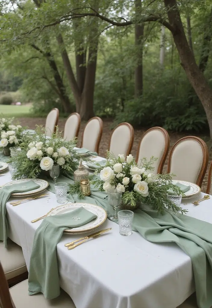
Soft sage green offers calm and natural charm for your wedding. It fits couples who love the outdoors and want a sustainable vibe. The color sits softly beside browns, creams, and blush, so blooms stay the focus. It acts as a gentle backdrop that makes flowers pop.
Here is why it works in real weddings:
– Easy to mix with different styles
– Keeps the room light and airy
Make this color work with practical ideas:
– Decor: sage green table linens, napkins, or a greenery arch
– Attire: bridesmaids in soft sage with simple accessories
– Florals: base bouquets in sage, with white and pale pink accents
– Textures: silk ribbons, matte ceramics, and warm wood echo sage
Next steps for a cohesive palette:
– Pair sage with cream or blush for refinement, or add deep burgundy for drama
– Layer textures with linen, wood, and wicker
– Check color in your venue lighting before you order
Eco-friendly tips:
– Use seed-paper invitations and decor you can replant
– Choose real plants or potted arrangements over disposable stems
How guests feel: the calm shade helps everyone relax. Warm lighting makes sage glow with earthy warmth
Common questions:
– Can sage feel modern? Yes, with clean lines and metal accents
– Is it hard to pull off? Not if you keep the palette simple
📅 Ultimate Wedding Planning Roadmap
Navigate your dream wedding effortlessly with our detailed roadmap tailored for eco-friendly and stylish celebrations.
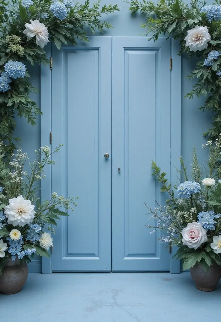
2. Dusty Blue
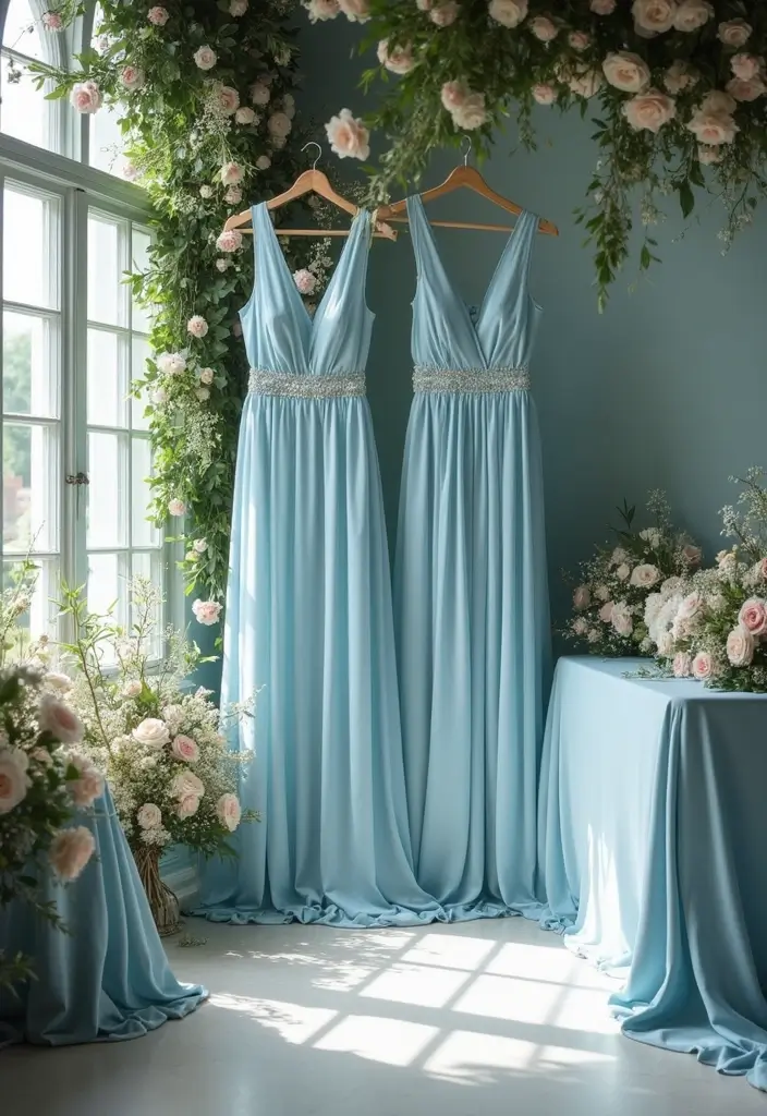
Dusty blue is a calm, chic choice for a 2025 wedding. It stays quiet and refined. This muted blue plays well with many tones, so you can mix ideas without clashing. It softens with warm yellows and tightens up with navy for a bold edge.
Here is why it matters: you get a flexible color that adds romance without shouting. It suits many venues, from easygoing barns to sleek ballrooms. Use dusty blue in fabrics, florals, and even cake decor to keep the look cohesive.
– Pairings that work:
– With soft yellows for a fresh, sunny feel
– With navy for a rich, dramatic look
– With ivory or champagne for a clean, timeless vibe
– Where to use it:
– Bridesmaid dresses in dusty blue satin or chiffon
– Table settings, napkins, and menus
– A cake with blue accents, like a ruffled tier or blue-painted detailing
– Practical setup tips:
– Use natural light plus warm bulbs to keep the color gentle
– Add texture with velvet, lace, or linen
– Include small blue accents in bouquets or signage for cohesion
Next steps: pick your shade, gather swatches, and test how the color looks in both photos and on site. Dusty blue blends and balances well when you plan carefully.
3. Terracotta
Terracotta
If you want a warm, earthy terracotta wedding color, this shade can be your anchor. This color brings a cozy, rustic vibe. Here is why it works: it mirrors clay and sunlit earth, so your day feels grounded. Pair terracotta with muted greens and whites to keep the palette soft.
Let’s break it down with practical ideas. For outdoor ceremonies, terracotta fits well with natural surroundings. Use terracotta pots as centerpieces or clay-colored tableware to reinforce the mood. Fabrics like linen in warm sand or ivory white blend with it without stealing the show. Pair terracotta with soft textures like burlap or twine for a rustic touch.
Next steps: plan warm lighting that glows. Add candles or string lights to boost the cozy vibe. Texture matters. Mix rough pottery surfaces with smooth glass and soft fabrics to add depth.
Tips for balance: keep terracotta as the main color and use greens or whites as accents. If you worry about too much warmth, add a cool touch like sage napkins. That keeps the look warm and fresh.
What you’ll get: a stylish, welcoming celebration that feels right for the setting. It works in barns, gardens, or patios with little effort.
4. Blush Pink
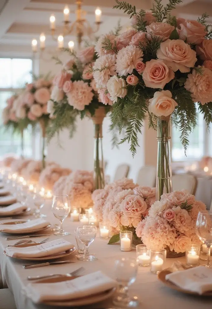
Blush pink stays popular because it feels romantic and calm. It adds warmth without shouting. You can pair it with gold, soft gray, or ivory to keep the mood gentle. For a bold twist, mix blush with navy or charcoal. The contrast makes a modern statement you can see and feel.
Here is how to use blush pink in your wedding day:
– Bridesmaid dresses in blush chiffon look effortless. Choose one of two shades so the line of color reads clearly.
– Florals with blush roses, white peonies, and greenery create a soft focal point on each table.
– Table settings use blush linens or chargers with gold flatware for a refined touch.
– Invitations and signage in blush accents tie the look together.
Why it works for many themes: blush pink can feel classic or contemporary depending on the pairing. It reads clean in daylight and glows by candlelight. When you mix one or two blush tones with stronger colors, you keep balance.
Let’s break it down with simple steps: start with a color board, test blush under your venue lights, and lock in one or two blush shades so everything links. Keep the rest neutral to avoid a patchwork finish. Blush pink is a versatile base for many wedding styles.
Next steps: gather fabric swatches, preview them in your ceremony and reception spaces, and finalize your palette before you place orders.
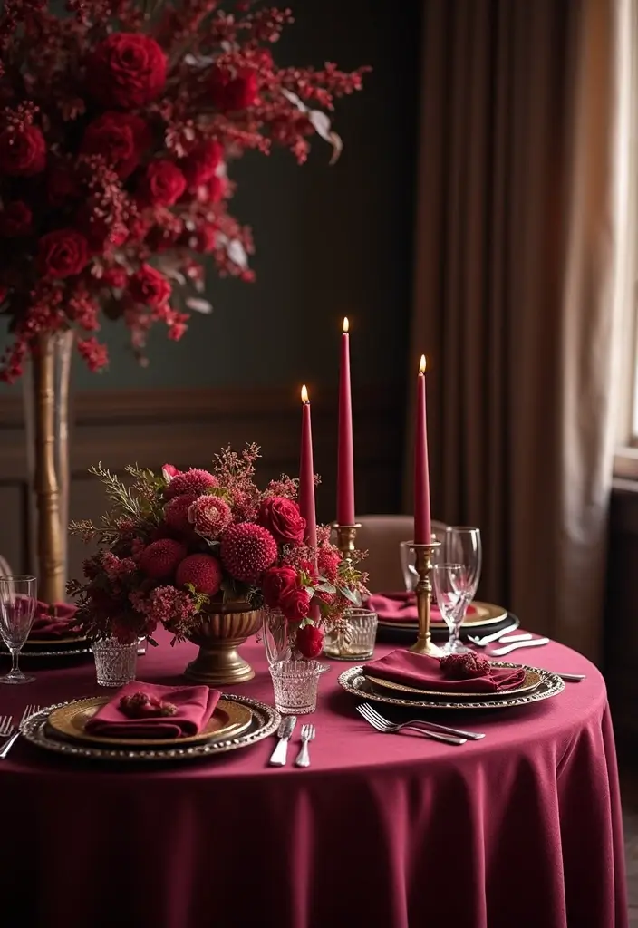
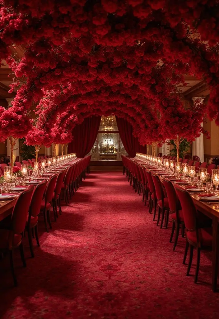
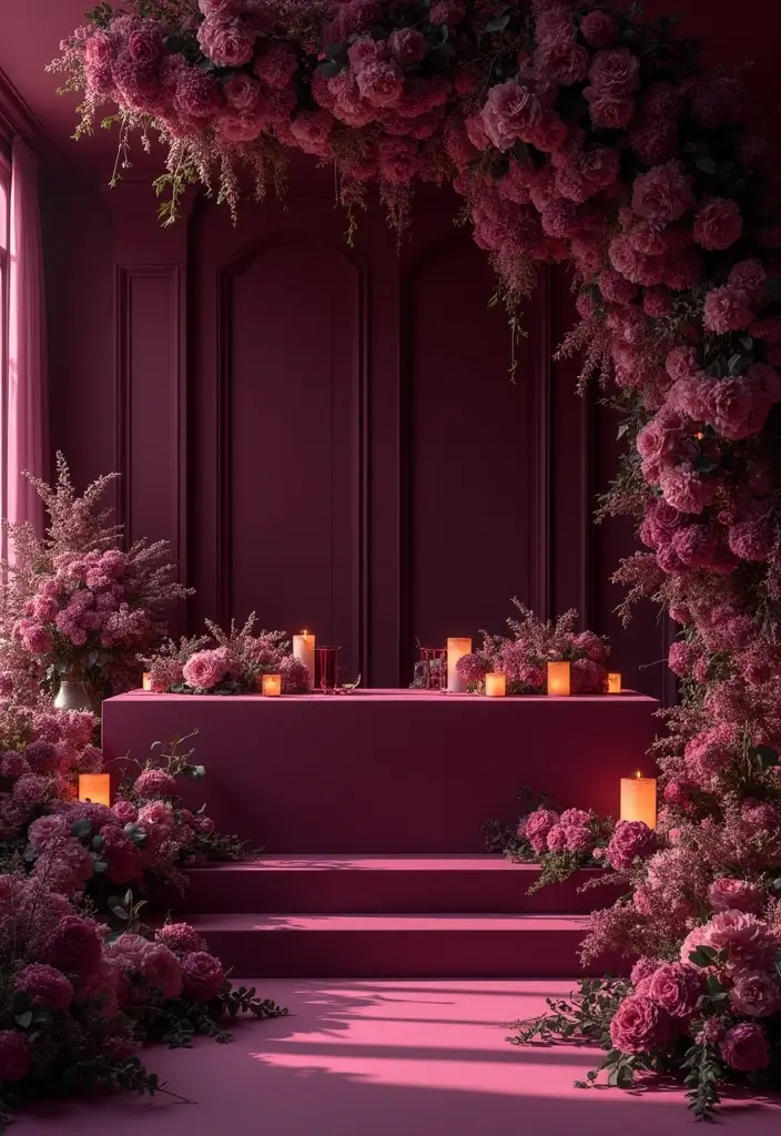
5. Rich Burgundy
Rich Burgundy
You want a color that feels luxurious and warm. Rich burgundy does that. It reads deep and stylish without shouting, and it adds depth to your wedding space.
Here is why it helps your look stand out:
– Pair it with cream or pale pink to keep things light.
– Mix in dark greens for a moody, forest vibe.
– Use burgundy in florals, table linens, or the groom’s suit for a cohesive look.
– Choose fabrics like velvet or satin for a luxe touch.
– Build a small mood board with swatches and photos to guide decisions.
How to use it in real life:
– Start with burgundy as a base for invitations, arch flowers, or bridesmaid dresses.
– Balance with cream runners, gold place cards, or bronze candles.
– Check lighting at your venue; burgundy can shift from wine to ruby under different lamps.
Season and mood:
– Burgundy shines in fall and winter, giving a warm, cozy feel.
– It signals elegance with a touch of drama without going overboard.
Practical steps:
– Gather fabric and floral swatches.
– Preview with your photographer in actual venue light.
– Build a simple plan: décor, attire, and details.
Use this wine-red palette to create a stylish, welcoming celebration.
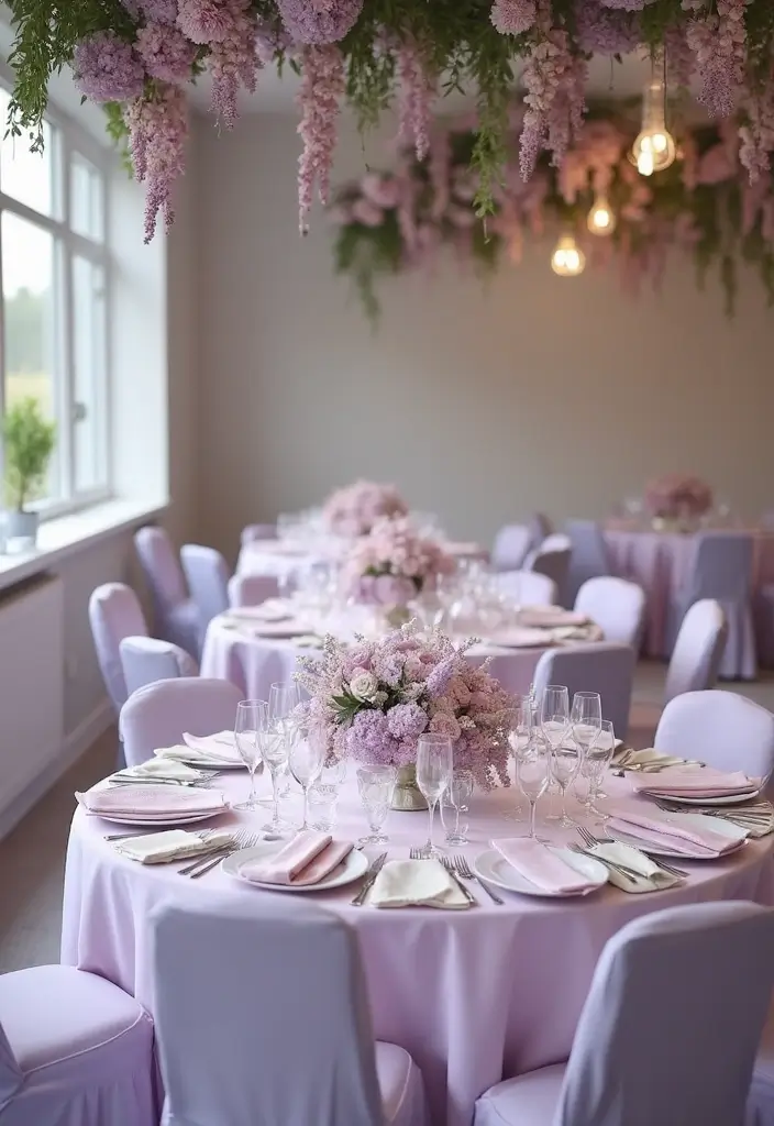
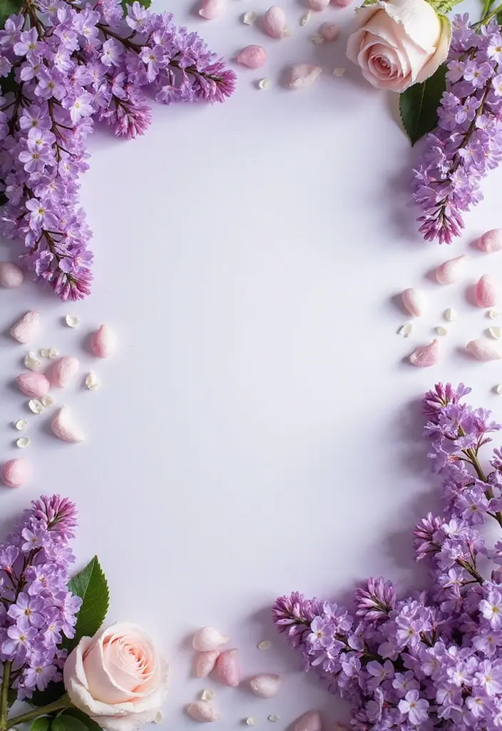
6. Soft Lavender
Soft Lavender
Soft lavender brings a calm, fresh feel to your wedding. It feels gentle yet romantic. Pair it with white and green for a clean, inviting look that photographs well in daylight.
Use it in a rustic or garden vibe. Think wildflower bouquets with lavender stems, white blooms, and a touch of greenery. On tabletops, lavender can show up as blooms on a simple white runner, or as a scented accent in small jars.
For a bolder mix, layer in deeper purples or soft yellows. Deep purples add depth; pale yellows lift the mood without stealing attention. In any palette, let lavender stay the quiet hero.
Practical ideas you can try:
– Floral choices: lavender bouquets, boutonnières with lavender sprigs, and greens.
– Decor touches: lavender linens, napkins, candles, and simple wooden accents.
– Attire notes: bridesmaids in lavender gowns or bridesmaids’ blooms with lavender accents; groom and groomsmen ties in a light shade.
Tips for photos and care:
– Lavender shines in natural light and rustic textures like wood and burlap.
– Keep bouquets hydrated and out of direct sun to prevent fading.
Next steps:
– Pick a shade: powder, lilac, or lilac with a hint of gray.
– Gather swatches, plan small mockups, and test with your flowers.
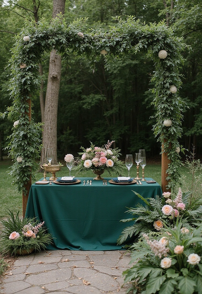
7. Forest Green
Forest green is a wedding color that helps you feel connected to the outdoors. It is a deep shade that echoes trees, moss, and leaves. If you plan a ceremony outside, this color sets the mood.
Here is why forest green works. It brings a calm, natural feel.
How to use forest green
– Use forest green in florals and greenery around your venue.
– Pair forest green with soft creams or warm terracotta for balance.
– Add forest green to table decor like napkins and runners.
Style ideas
– Rustic weddings shine with wood textures and lots of greenery.
– Bohemian settings gain an elegant touch from leafy accents.
– Lighting matters; warm candlelight makes the green glow.
Practical tips
– Choose fabrics in forest green for bridesmaid dresses or table linens.
– Mix in lighter greens and neutral tones so the space does not feel heavy.
– Plan with local greenery to save money and cut waste.
Next steps
– Create a mood board that shows forest greens with creams and terracotta.
– Talk to your florist about lush greenery and long-lasting leaves.
– Test a few fabric swatches in natural light before you buy.
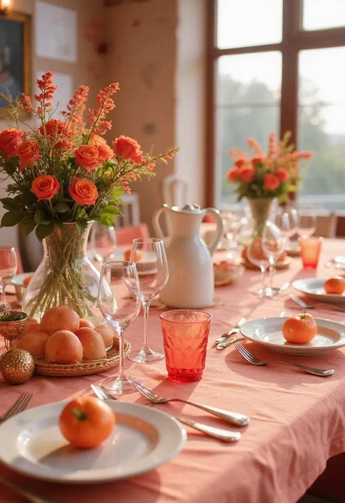
8. Peach
Peach is a fresh choice that adds warmth to your wedding day. It catches the light and feels bright without shouting. Peach comes in blends like blush peach, apricot, and peach with a pink undertone. Choose a shade that fits your mood and season. Here is why peach works in 2025 weddings.
Let’s break it down. It pairs naturally with deep navy or steel gray. It also looks soft with sage green or champagne gold. In spring and summer, peach blooms glow in photos. You can layer peach with a cool blue or gray to keep the look calm, and you can let a darker tone ground the palette.
Next steps for practical use:
– Use peach in bridesmaid dresses in light chiffon or satin
– Layer peach in floral arrangements with roses, peonies, and other blooms
– Add peach to the cake with a glaze or small fondant accents
– Bring peach into table settings with runners, napkins and place cards
– Accent invitations, signage, and envelopes with peach borders or fonts
By starting with a single peach shade and pairing it with a dark anchor, you get warmth plus elegance. Test swatches in natural light, check fabric textures, and keep the look cohesive.
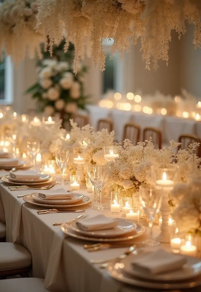
9. Ivory
If you want a timeless ivory color palette for your wedding, ivory could be your anchor. It feels warm and refined. Ivory gives other colors space to shine and pairs well with deep greens, rich gold, or soft pastels. It blends with dresses, linens, and blooms.
Here is why ivory works. Its warmth keeps things inviting without shouting. It feels calm in bright light or candlelight, and it helps your outfits and flowers look harmonious.
Ways to use ivory
– Use ivory as the main color in wedding dresses, table linens, and floral designs to create a cohesive look.
– Mix ivory with soft pastels like blush or champagne to keep mood light.
– Bring texture with ivory lace, satin, or linen to add depth without color.
– Apply ivory on invitations, cake panels, napkins, chair sashes to give a warm welcome.
– For lighting, warm bulbs and amber candles to let ivory glow.
Practical tips
– Test swatches at your venue before you buy.
– See how ivory looks in natural light and under soft bulbs.
– Remember, ivory is not white and needs texture and lighting to shine.
– Next steps: gather fabric samples, compare trims, and plan a small mock setup.
With care, ivory brings calm and refinement to your day.
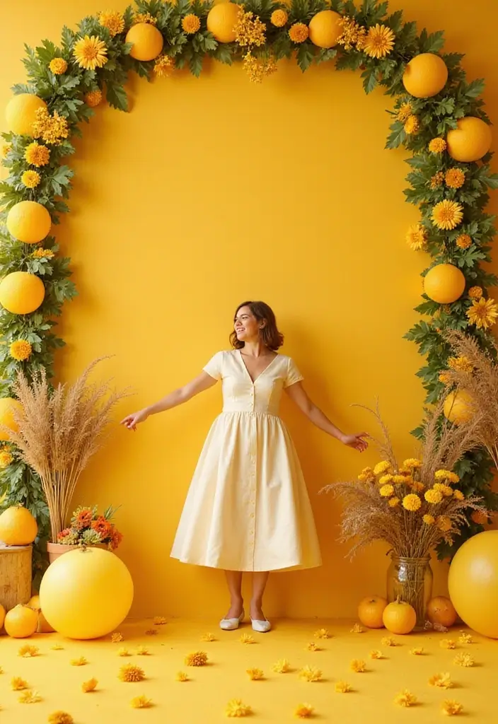
10. Mustard Yellow
Why mustard yellow works
Here is why it helps your wedding look warm and welcoming. It stays clear and approachable while still making a statement you will notice.
Pairing and where to use it
– Pair mustard with navy, gray, or ivory. These neutrals keep the color grounded.
– Use it in three places to avoid overload. Try florals, bridesmaid dresses, and a cake detail.
– Mix textures. Combine matte fabrics with a satin ribbon or wood tones for depth.
Next steps
– Build a small palette. Choose mustard plus two calm shades.
– Create a simple mood board with flowers, dresses, and decor in those colors.
– Test the color in real life with swatches or a mini bouquet.
Seasonal notes and vibe
Mustard shines in summer and fall when sunlight makes it glow. It fits both modern and classic themes.
Practical ideas to try now
– Put mustard napkin rings on wooden tables.
– Add mustard stems to bouquets to tie the look together.
– Keep most decor neutral so the color pops.
Common questions
– Is mustard yellow hard to match? It pairs well with deep blues, grays, and creams.
– Should you use it everywhere? No. Use it as a bold accent to guide the eye.
You might also like
11. Ocean Blue
Are you trying to pick a color that feels peaceful and chic for your 2025 wedding? Ocean blue can be your answer. It echoes calm sea air and bright, open skies. You can use it with sandy neutrals and crisp whites for a clean, breezy vibe.
Here is why it works. Ocean blue reads as soft and timeless, not loud. It cools down a room and helps guests relax. It pairs well with natural textures like linen, wood, and salted raffia. This makes your wedding look polished without feeling stiff.
How to use ocean blue in real life
– Table styling: choose tablecloths or runners in a light ocean blue and add white plates with sea glass accents.
– Invitations and stationery: pick a deep but not navy shade for a modern, readable look.
– Bridal party: let bridesmaids wear ocean blue gowns or mix in lighter blue tones with white bouquets.
– Floral and cake accents: add small blue blooms or blue-trosted desserts for pops of color.
Best seasons and settings
– Summer and seaside venues shine with this color.
– It fits beach clubs, garden ceremonies, and lodge weddings alike.
Shade tips and pairings
– Mix a sky blue or teal for depth.
– Add silver or gold touches for a chic glow.
– Keep lighting bright to keep the color fresh.
Common questions
– Will it feel cold? Not if you balance with warm neutrals and natural textures.
– Is it easy to coordinate? Yes—bring it into linens, invites, and small decor first.
Next steps
– Gather swatches in ocean blue, sky blue, and teal.
– Map where you want color pops: linens, invites, or florals.
– Test under your venue lighting to see the final mood.
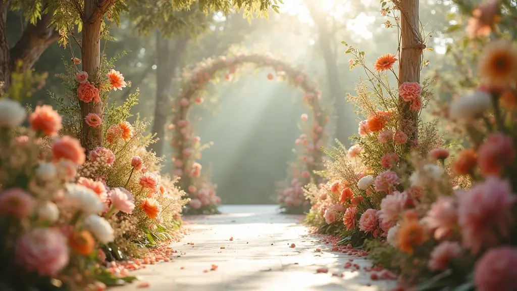
12. Coral
If you want a color that feels warm and stylish for 2025, coral fits right in. You get a friendly glow without overdoing it. Coral works as a main shade or a bright accent, and it photographs beautifully.
Shade options
– Soft peach coral for a gentle, romantic vibe.
– Classic bright coral for a bold pop.
– Coral pink for a warmer, blush-like touch.
Choose your shade by how much you want it to stand out. A softer coral blends with many fabrics; a brighter tone makes a statement.
Pairings
Coral plays well with teal or seafoam for contrast. It also pairs nicely with white, navy, and gold for a clean, classy look. Add a hint of mint or sage for a fresh feel. For invitations or cake details, coral ink or fondant can look modern and tasteful.
Practical uses
In flowers, mix ranunculus, roses, and greenery with coral centers. For dresses, pick bridesmaids in a shade that suits most skin tones. Use coral as a table runner, napkin band, or charger color. Let coral appear in small desserts, candle holders, or stationery accents.
Here is a simple way to start: pick two main colors, test fabric swatches, and visualize with a quick table mockup.
Next steps: check lighting at your venue, view sample florals, and lock in your coral shade family.
13. Metallic Gold
Metallic gold brings luxury to wedding decor. You get warmth and shine without going over the top. This color pairs well with jewel tones like emerald and sapphire, or soft pastels like blush and champagne. The result is a stylish, timeless glow.
Ways to use metallic gold
– Tables and place settings: gold flatware, gold chargers, or gold place cards.
– Centerpieces: spray gold leaves, votive candles, or a gold vase.
– Details on the bridal look: subtle gold embroidery or a belt.
– Cakes and desserts: gold leaf or gold painted accents.
How to pull it off
– Start with one gold element as the focal point. That keeps the space elegant.
– Mix metal tones. Use brushed matte gold with shiny polished gold to add depth.
– Control the shine. Pair high glow pieces with quiet textures like velvet or linen.
– Light matters. Place candles or fairy lights to make gold sparkle.
Color pairings and vibe
– Pair with jewel tones for drama: deep reds, greens, and blues.
– Pair with soft hues for romance: ivory, pink, and champagne.
– Keep it balanced. Limit gold to two or three accents per table.
Next steps
– Decide the vibe you want: warm luxury or crisp opulence.
– Choose your main gold item and plan the rest around it.
– Check samples in daylight to see how they read.
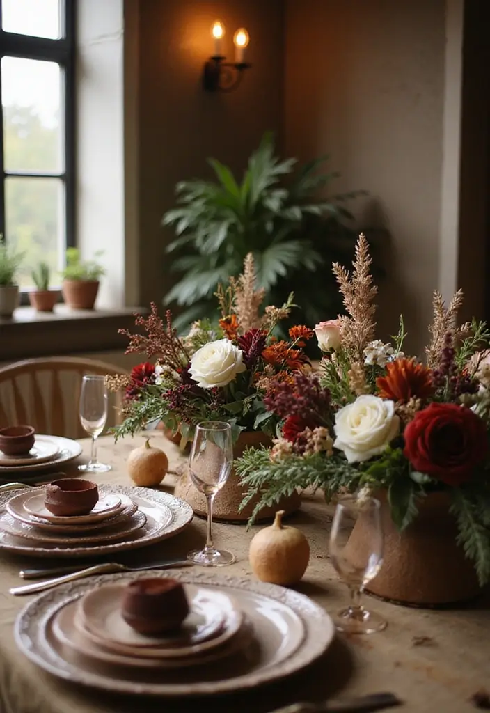
14. Chocolate Brown
Chocolate brown
You want a color that feels warm and timeless. Chocolate brown gives that quiet depth to your wedding palette. It works well with vivid burnt orange or soft blush, creating a natural contrast you can see and feel.
Use chocolate brown in table settings, floral ideas, and even wedding favors. On tables, try a chocolate linen, dark chargers, and wood place cards. In the bouquet, add dried grasses or seed pods for a subtle brown accent. For favors, wrap gifts in brown paper and tie with a light ribbon.
This shade fits rustic or autumn weddings best. It creates a cozy, grounded vibe that makes guests feel at home. The brown base acts like soil and wood, bringing your ceremony closer to nature.
How to make it shine:
– Start with a main chocolate brown you love and test it in natural light.
– Pair it with burnt orange for heat or blush for softness.
– Add texture with wood, jute, and cream fabrics to keep the look bright.
Next steps for your plan:
– Choose linens, chairs, and paper goods in the brown family.
– Balance with lighter tones and soft greenery.
– Check lighting at your venue to see how the brown tone reads at 5 pm and after dark.
15. Teal
Teal is a bold jewel tone that brings energy to your wedding. It reads bright in daylight and soft in candlelight when paired with warmer hues like coral or peach. You can shape a balanced teal palette that feels polished, not loud.
Ways to use teal in real setups:
– Table decor: teal linens, napkins, or chargers create a confident base.
– Florals: mix teal blooms with coral sprays to pop without shouting.
– Attire: add teal accents in bridesmaid dresses, ties, or pocket squares for a cohesive look.
– Signage and paper goods: teal invites, menu cards, and signs tie the theme together.
– Cakes and desserts: small teal accents on fondant or sugar work link the elements.
Palette and pairing tips:
– Start with a teal shade you love. Add ivory or soft sand as a calm backdrop.
– Layer texture: velvet, satin, or linen to keep depth.
– Control brightness with lighting; soft amber can mellow teal.
Common questions:
– Will teal clash with gold? Not if you use it as a bold accent and choose warm neutrals.
– Is teal too bold for a small space? Pair with lighter neutrals to keep it intimate.
Next steps:
– Build a tiny mockup board, test photos in daylight, then refine with your venue’s lighting.
16. Creamy Ivory
Creamy ivory is a soft, warm color that anchors a wedding palette. You get a calm base that lets bold colors shine. This ivory works well with jewel tones or gentle pastels. It suits both classic and vintage looks, making your day feel timeless.
Here is why creamy ivory earns a place in your color plan. It reflects light softly, adding warmth to photos. It adapts across fabrics, from satin to lace to chiffon, without clashing with other hues. It creates space for color to pop instead of competing with it.
– Table linens Creamy ivory tablecloths set a stage for napkins in emerald, sapphire, or ruby.
– Floral accents Ivory centers let blooms stand out, with ribbons or buds in bold colors.
– Bridal attire Creamy ivory gowns or lace details bring warmth to the bridal party.
– Cakes and desserts Ivory fondant keeps sweets elegant while other colors shine on toppers.
– Lighting and decor Warm white lighting with ivory fabrics adds a welcoming glow to the room that guests notice.
Avoid too much contrast in bright rooms, as ivory can read as white. If you add gold or bronze accents, you gain a soft, glowing finish. Keep swatches handy. Next steps: try swatches, test in your venue, and plan tiny touches first.
17. Champagne Pink
Here is why champagne pink works for many weddings. It reads soft and refined, not loud. The pink champagne shade sits between cream and pink. It blends well with gold accents or deep jewel tones, so you can add sparkle or drama without losing its gentle feel.
Let’s break it down.
Where to use champagne pink
– Floral arrangements: ribbons on bouquets, centerpieces with pale roses and ranunculus.
– Bridesmaid dresses: soft satin or chiffon in champagne pink.
– Table settings: napkins, runners, candles, place cards.
– Other touches: cake piping, invitations, signage.
Style tips
Match this color with your venue to keep the look cohesive.
– For upscale weddings, pair champagne pink with gold leaf and crystal details.
– For intimate celebrations, mix in cream and taupe to keep warmth.
– Let lighting do the work; candlelight makes the pink glow.
Common questions
– Will it clash with pure white? No. Pair with ivory or warm whites.
– Will it look washed out in daylight? Layer it with deeper tones like burgundy or emerald for contrast.
Practical note
It can read pale on very bright white schemes. Balance with richer tones so it stands out.
Next steps
1) Decide which elements will carry champagne pink.
2) Pick two complement colors.
3) Compare swatches in natural light.
18. Light Gray
Light gray: a calm, modern wedding color
Light gray adds calm and polish to your day. It feels fresh and timeless. If you want a shade that fits many themes, this is a solid choice.
– Table settings: napkins, runners, and place cards in soft gray for a cohesive, understated look.
– Floral accents: ribbons or wrapping in gray tie bouquets to the overall palette.
– Attire: bridesmaids’ dresses, ties, or boutonnieres in light gray keep the focus on the gown and flowers.
– Backdrops and linens: drapes, chair covers, and tablecloths in gray add depth without stealing the scene.
– Lighting and texture: pair gray fabrics with warm bulbs or candles to keep the mood welcoming.
Light gray shines when paired with pastels or bold colors. Try blush and sage, navy, or emerald. It acts as a neutral canvas that helps other hues pop.
Here is why it fits different vibes: in a minimalist wedding, it softens lines without glare. In a contemporary setting, it keeps spaces clean and elegant.
Common questions:
– Will light gray feel dull? Add color pops and varied textures to keep it lively.
– Does it go with ivory or white? Yes. It smooths edges and boosts contrast with brighter tones.
Next steps: start with fabric swatches, test lighting, and plan a small sample setup to see how the shade reads in your venue.
19. Ruby Red
Here is why ruby red can elevate your wedding. It feels bold, warm, and memorable. You see it stand out against whites, ivories, and soft gold.
Ruby red pairs best with gold or cream. In winter, it adds a warm glow to the room.
– Floral design: choose ruby blooms like roses or lisianthus. Mix with ivory blooms and a touch of gold spray or ribbon.
– Table styling: add ruby red runners or napkin ties. Use gold chargers and cream place cards to keep balance.
– Attire and decor accents: a ruby red bouquet for you, small ruby touches on the groom’s tie, and ribbon on chairs for cohesion.
– Cake and sweets: a ruby red cake with gold leaf, or red velvet sweets on a white display.
– Lighting: warm amber lights or candles deepen the color and create a cozy mood.
Next steps:
1) Pick a ruby red shade that fits your venue and season.
2) Choose 1–2 gold or cream accents to repeat throughout.
3) Test swatches in daylight and at twilight to see how it reads in photos.
4) Review the look with your photographer and planner.
Common tips:
– Use ruby red as a highlight, not the whole room.
– Mix textures like velvet, satin, and metallic.
– Check photos to ensure the color reads as you expect.
End note: Ruby red signals love and warmth and helps guide the eye to your most important moments.
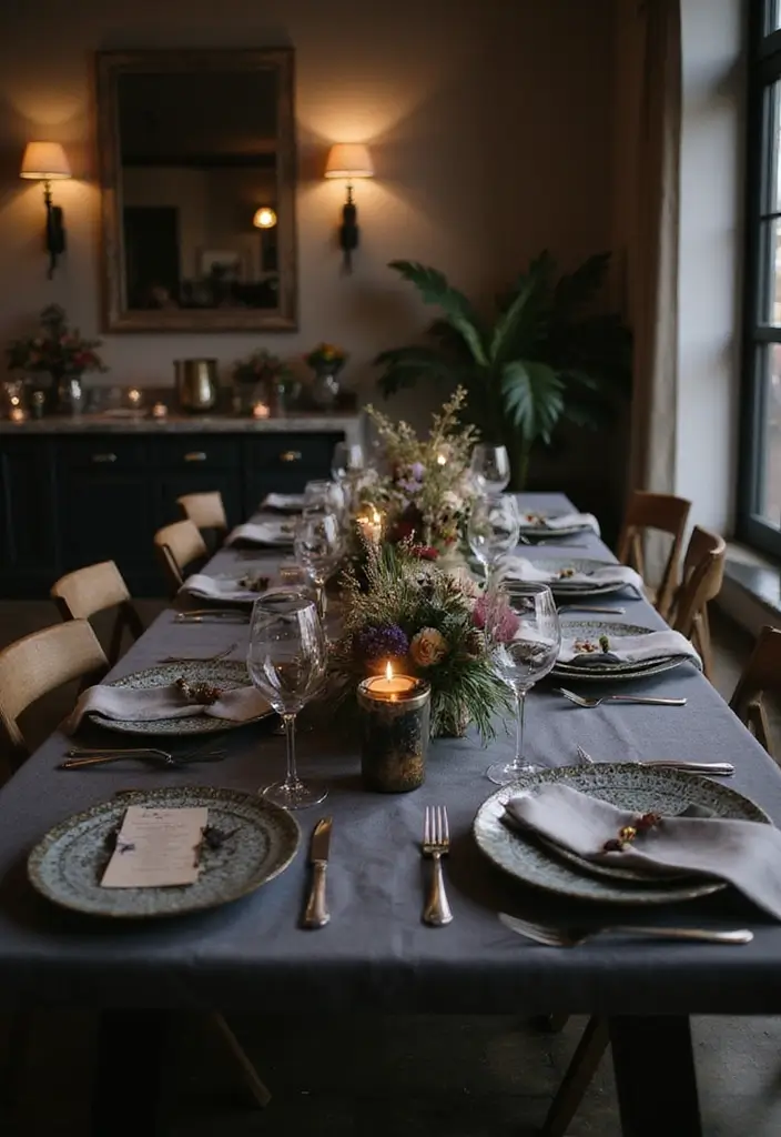
20. Charcoal Gray
Charcoal gray sets a modern, calm mood for weddings. You get depth without shouting color, and it looks stylish in photos from day to night. This shade acts as a strong base you can build on.
Why charcoal gray shines in 2025 weddings
– It pairs easily with soft colors like blush, ivory, and champagne for a romantic vibe.
– It keeps a look polished in urban or contemporary venues.
– It works in many elements, from table linens to gowns, without stealing the show.
Ways to use charcoal gray in your wedding
– Decor and tables: add charcoal gray runners or linens, balance with ivory plates, and splash warm metallic accents.
– Flowers and centerpieces: pick light blooms and let charcoal gray vessels frame them.
– Attire: let the groom’s suit or the wedding party feature charcoal gray pieces, while the bride wears lighter tones to balance.
– Lighting: dimmed candles and soft uplighting bring warmth to the dark shade.
Tips and limits
– Texture matters. Velvet, wood, and soft fabrics keep the look inviting.
– Pair with warm metals like gold or brass for gentle glow.
– Charcoal gray goes well with white; test it with your exact fabrics.
Next steps
Pick a few swatches, compare at sunset, and map where the shade will show in invites, bouquets, and table settings.
21. Steel Blue
Steel blue in practice
If you want a calm, chic wedding look, steel blue can be your anchor. It pairs easily with white, ivory, and warm metallics like gold or champagne, keeping the vibe refined rather than loud.
Here is why it shines. The shade reads soft in daylight and glows under candlelight. It adds depth without stealing the spotlight.
Where to use it
– Florals: Choose steel blue blooms like delphiniums and hydrangeas, paired with white roses for contrast. Add a touch of greenery so the bouquet looks fresh.
– Attire: Bridesmaids in steel blue satin or velvet look polished in any season. Mix in soft silver jewelry or light gray shoes for balance.
– Tables and decor: Table settings in steel blue create depth when paired with white linens. Use warm gold or brass accents to keep the scene inviting.
– Details: Invitations and place cards with steel blue borders pull the look through. Add textured ribbons on chairs or menus for subtle contrast.
Next steps
1) Build a color board with steel blue swatches, whites, and gold tones.
2) Request fabric and floral samples to see the color in your light.
3) Plan a lighting test at your venue to confirm mood.
With steel blue, you get calm elegance that fits both modern and classic themes.
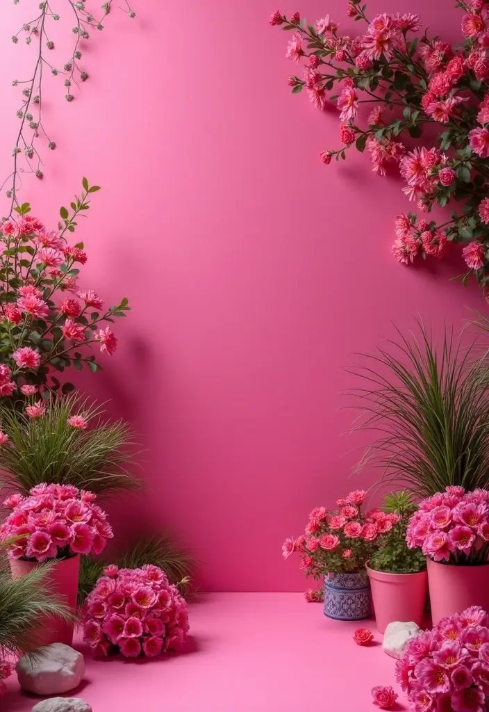
22. Bright Fuchsia
Bright fuchsia helps you create a wedding that feels bold yet refined. It catches the eye without shouting. This pink shade leans toward magenta, so it looks modern in photos and on fabric. Pair it with deep blue or soft gray to make the color pop.
Here is why it works for weddings: it adds warmth, it photographs well, and it fits spring and summer moods.
Let’s break it down with practical uses:
– Florals: combine fuchsia dahlias with white roses for a bright bouquet and strong centerpieces.
– Table decor: use fuchsia napkins, a runner, or candles against white plateware for contrast.
– Bridal accents: a fuchsia belt, shoes, or a wrap can highlight your waist or add a subtle glow.
– Bridesmaids: one or two dresses in fuchsia anchor the group without dominating the whole look.
Season and mood: Bright fuchsia shines in spring and summer weddings; it pairs well with greens and airy venues. In evening receptions, it holds its own under warm lighting, giving you a glow without overpowering other colors.
Next, pairings and balance:
– Best matches: navy, charcoal gray, and cream.
– Metallic accents: gold or copper add a soft glow.
Tips for implementation:
– Start with about 60% neutrals, 30% secondary color, 10% bright fuchsia.
– Check swatches under natural light and in the wedding venue.
– Choose fabrics that reflect light differently; satin shines, matte tones soften.
Next steps: make a color board, order swatches, and test a sample bouquet in your venue light.
23. Lilac
Lilac in your wedding palette
Lilac is a soft, romantic shade that adds quiet elegance to your day. It feels fresh and timeless, perfect for spring but easy to work into any season with the right lighting and textures. You can make lilac a star color or use it as a gentle accent that helps whites, greens, and deeper purples stand out.
Here is how you can use lilac effectively
– Florals and greenery: choose lilac roses, lilac sprays, or lavender for bouquets and centerpieces. Pair them with white blooms and fresh greens. Add a few deeper purple flowers to create depth and interest. This mix photographs beautifully in natural light.
– Attire and décor: consider lilac bridesmaid dresses or lilac sashes. Use lilac table runners, napkins, or chair accents to tie a look together without overwhelming the scene.
– Stationery and sweets: print invitations with lilac ink or foil for a soft touch. Add lilac fondant details or ribbon on the cake to echo the palette.
– Lighting and ambiance: soft lilac uplighting or candlelight creates a dreamy glow without shouting the color. It helps photos look warm and romantic.
Best pairings that enhance lilac
– White for a crisp, clean backdrop where lilac really pops.
– Sage green or dusty greens for a natural, fresh vibe.
– Deeper purples to add contrast and dimension.
– Gold or champagne accents to lift the look with a subtle shine.
Practical tips to get it right
– Start with one main lilac shade and test it in fabrics and florals.
– Mix textures like satin, chiffon, and velvet to keep the look rich but approachable.
– Bring in greenery to keep the color from feeling flat.
– Check your lighting plan; softer light flatters lilac and helps photos glow.
What to watch for and next steps
– Lilac can fade under harsh sun, so plan for shade or indoor spaces during peak day warmth.
– Build a mood board with swatches from flowers, fabrics, and décor to confirm harmony.
– Work with your florist and planner to map where lilac will appear first so the look stays cohesive.
Next steps: gather fabric swatches, pin lilac-inspired photos, and ask your team to create a small color run for testing. Your lilac theme will bring a calm, timeless charm to your celebration.
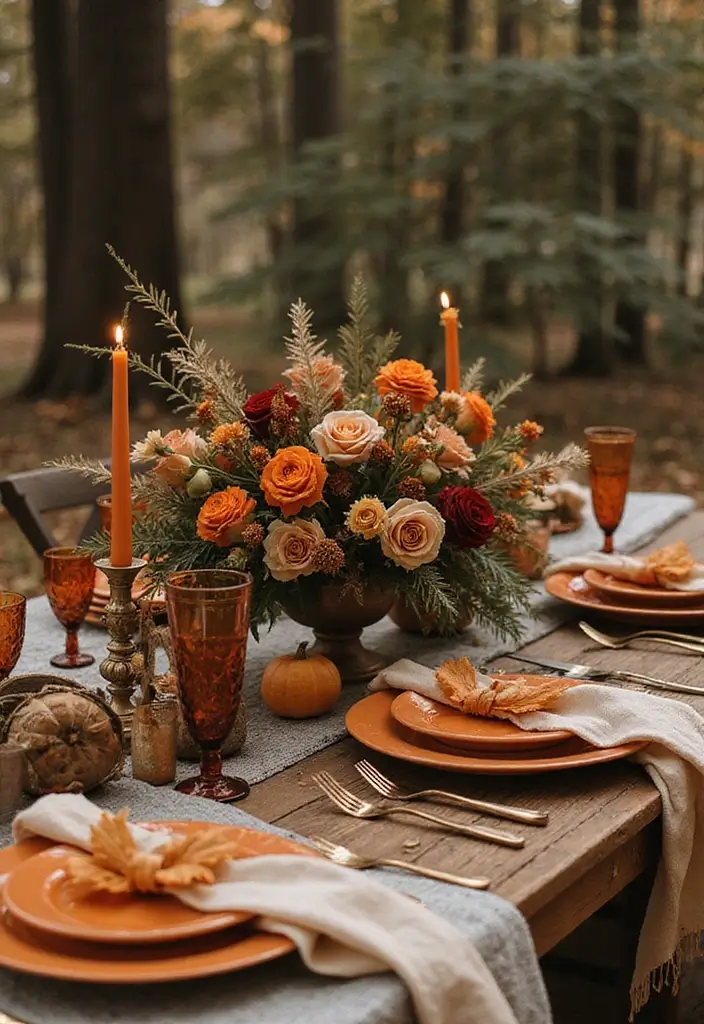
24. Burnt Orange
Burnt orange
Want a warm fall vibe? Burnt orange can be your anchor. It pairs with creams and deep greens for a soft yet rich palette. Here is why it works in wedding decor.
– Floral accents Use burnt orange blooms in bouquets, boutonnieres, and centerpieces. Pair with ivory and dark greenery for contrast.
– Table and decor Add a burnt orange runner, napkins, or candleholders. The color creates a warm glow without overpowering the scene.
– Cake and dessert details A touch of burnt orange on ribbons, fondant accents, or sugar flowers ties the cake to your color story.
– Attire and accessories Let a few bridesmaids wear burnt orange gowns or add a belt or wrap.
– Venue fit The look shines in rustic barns or modern rooms with warm lighting and wood accents.
– Texture and finish Mix matte fabrics with satin ribbons for depth. Velvet touches on greenery or chairs add a tactile lift.
– Color pairings Pair burnt orange with cream for softness. Add sage for earthiness. Try navy for contrast or charcoal for a modern edge.
– Practical tips Test the color in daylight and warm light at your venue. Bring swatches to check how it reads on fabric and florals.
– Common questions Will burnt orange feel heavy in bright daylight? Balance it with light neutrals and metal accents.
Next steps: collect swatches, review with your planner, and visualize a sample tablescape.
Test it under venue lights to confirm.
25. Light Peach
Light peach is a soft, warm shade that adds romance to your wedding. It gives a gentle glow in photos and stays elegant with clean whites. If you want a color that feels fresh and timeless, light peach fits. Here is why it works.
Light peach sits between pink and cream. It reads warm and inviting. It pairs with white and greens, and it can glow with jewel tones like emerald or navy when you want more drama. The result is a cohesive palette you can carry across florals, attire, and décor.
Next steps: use light peach across florals, attire, and décor so the look ties together.
– Florals and greens
– Light peach blooms such as roses, peonies, or ranunculus. Pair them with ivory flowers and greens like eucalyptus or sage.
– Attire and accessories
– Try light peach bridesmaid dresses or peach accents on bouquets. Use ribbons or sashes to connect outfits to the color plan.
– Décor and table settings
– Add light peach napkins or a peach runner. Pair with white linens and gold touches.
– Cake and stationery
– Peach accents on the cake and invitations feel coordinated and refined.
Light peach works best in spring and summer. It creates a welcoming mood without loudness. If it reads too pink in bright sun, balance with ivory and deeper greens.
Next steps: test swatches in natural light next to white and greens to see the true tone.
26. Deep Plum
If you want a look that feels bold yet refined, deep plum can lead the way. This rich wine shade adds warmth and a touch of drama to any wedding palette. It pairs beautifully with gold, cream, and even bright reds for a compelling contrast.
Here is why it works. Use deep plum to anchor autumn and winter celebrations. It gives you depth in florals, linens, and accents without overpowering other colors. You can mix it with soft creams and warm gold for a luxurious, cohesive vibe.
– Floral arrangements with deep plum roses or orchids
– Table settings with plum napkins, gold chargers, and cream linens
– Bridesmaid dresses in deep plum for a regal yet soft look
– Invitations or signage featuring plum accents
If you want a softer look, pair plum with pale blush.
Next steps: choose a focal area, then build around it. Start with a plum centerpiece or a plum dress swatch to guide your other choices. Add texture with velvet or satin for a lush feel. Keep lighting warm—think amber candles or soft fairy lights—to heighten the color’s warmth. Deep plum is not loud, but it leaves a lasting impression that makes your day feel rich and memorable.
Conclusion
Choosing the right wedding colors is more than just aesthetics; it’s about reflecting your personal style and values as a couple.
With these 26 elegant eco-friendly color options for 2025, you’re sure to find a palette that resonates with you, enhances the beauty of your wedding day, and aligns with sustainable practices.
Embrace these trends and create a celebration that is not only beautiful but also meaningful and responsible.
Note: We aim to provide accurate product links, but some may occasionally expire or become unavailable. If this happens, please search directly on Amazon for the product or a suitable alternative.
This post contains Amazon affiliate links, meaning I may earn a small commission if you purchase through my links, at no extra cost to you.
Related Topics
2025 wedding colors
elegant wedding palettes
sustainable weddings
wedding color trends
eco-friendly décor
color combinations
wedding themes
romantic color schemes
seasonal wedding colors
wedding decor ideas
modern wedding colors
stylish wedding aesthetics
